Power of the User: Lessons learned from mHealth usability testing & tips for your innovation
You have a compelling new idea for a technology product that you think can bring about big health impacts. But how do you ensure that people will actually want to use it? How do you really dig into the interaction between user and product?
By doing research that focuses on the human element and the user experience, we can ensure that we’re capturing critical user insights early on. At the Institute for Reproductive Health (IRH), we learned the value of this process over the past few months as we worked with iHub Research to explore the ways in which women in Nairobi interacted with three mobile and digital products for family planning: CycleTel™, (a SMS-based service), CycleBeads® Online (an online service), and CycleBeads Android app (the latter two developed by Cycle Technologies).
All three of those tools help women to successfully use the Standard Days Method® of family planning—a method that has been offered widely in developing countries for over a decade. We wanted to understand how these tools, developed and used successfully in the U.S., would be received in Nairobi: were they easy-to-use and desirable?
Through individual interviews, usability tests, and creative focus groups, we gathered users’ impressions of the products. While the individual interviews and focus groups gave us some fascinating insights, the usability tests were especially eye opening. Usability testing is a crucial way to see how products will be experienced and understood by real potential users. For mHealth, this process is particularly important because the consequences of misunderstanding health information—or in this case, misusing a family planning method—are so grave.
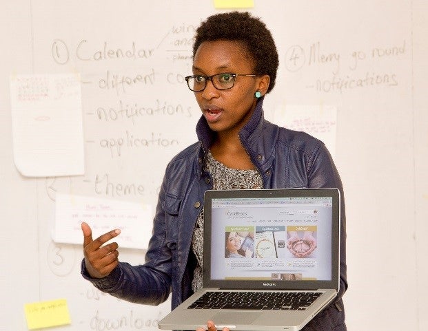
Harnessing iHub User Experience Lab’s expertise in designing products for the local context, we were able to uncover ways in which each digital service could be improved for the Nairobi market, and translate these into clear modifications of the products to better meet user needs.
So how can you use usability testing to bring your solution to a new users?
There is a whole body of research on human-centered design. But here are some lessons learned from our first-hand experience at applying these principles, and tips for integrating usability testing to improve your technology:
1. Put the technology in the hands of the user, and sit back.
We simply handed each woman the CycleBeads smartphone app or CycleBeads Online to navigate through on their own. As they began exploring the products, we watched and listened—but did not intervene. We found it fascinating how women responded differently to the various digital tools. Some would dive right in and begin touching the screens, while others were hesitant to explore. Some women read screens closely, but many skimmed through.
Our tips:
- Be patient. It’s hard not to jump in with advice or answer a participant’s questions, but it’s much more interesting to see what they can and cannot figure out on their own. It also gives them space to continue to refine their own understanding. For example, one user changed her answer for “what do the bead colors mean?” three times as she was exposed to new information. We would have missed that thought process if we had simply told her the correct answer the first time.
- Build user confidence in giving feedback. It is important for the user to understand that her feedback is valuable. You want to know about her problems in order to improve the service. In different contexts and cultures, people may be hesitant to provide their honest opinions. You may say: “It’s not you; it’s the tool,” to encourage openness.
- Be open-minded. Recognize that any problems the user is having are not a reflection of the user, but an opportunity to improve the design.
2. Observe, carefully.
iHub researchers watched how the users move through the screens of the app, noting their facial expressions when they encounter something new. With a video camera focused on the users’ phone screens, we recorded where their fingers moved (and didn’t move). We asked ourselves: Do they scroll through pages or look for buttons? Do they seem familiar with the icons and terms used?
Our tips:
- Consider filming the screen of the technology. Multiple data sources—film, voice recording, note-taking—can offer deeper understanding of the user experience.
- Have users test the technology on their own devices. That way, you’re sure that stumbling blocks are due to challenges with the mHealth product, and not with usability of an unfamiliar device. Note that sometimes this isn’t possible (it wasn’t for us), but at least find out what device they use regularly and how they use it.
3. Ask questions, and then ask more questions.
After prompting the women to register and navigate through the app experience, we asked direct questions: How will you accomplish X task? Can you interpret the information you just read? What do the bead colors mean? Then, we asked them to reflect on the overall experience: Is this easy or hard, why? What was your thought process when doing X? What do you think this app is used for? Who could use this app? Our interviewers did much more listening and watching than they did talking.
Our tip:
- Keep digging deeper. Ask why and then ask why again, and then make sure you understand the answer. It is key to gaining clarity about what the user is thinking and how they are feeling about the experience.
4. Iterate! Make changes and repeat.
Based on this user testing, our team was able to make the major decision to move forward with only one product for primary testing—the CycleBeads Android app—because women responded most favorably to it. But despite the fact that women liked the app, they identified key features that could be improved. iHub and IRH prioritized these changes and made recommendations to the app developer, Cycle Technologies. Cycle Technologies then evaluated and made changes.
Our tips:
- Make information easier to digest. User feedback quickly told us we needed to edit it down, making the app more intuitive and minimizing the amount of text on each screen.
- Don’t be afraid of small changes. Because of our time frame and the types of changes identified, we chose to prioritize a few small changes that we thought would have the biggest impact.
- Don’t be afraid of big changes. Our work showed that users generally responded positively to the app and appreciated the general concept behind it. But if that had not been the case, we would have gone back to the drawing board.
This process isn’t over for us. Fieldwork just ended on the second round of testing, where we asked women to interact with the product for a month, rather than just an hour. This more extended trial should give us even better insight into how the CycleBeads app can be improved to better serve women in Kenya and elsewhere in the developing world.
And usability testing is now a reliable addition to the IRH toolbox.
Learn More
Visit CycleBeads.com to experience the tested technology for yourself.
USAID features CycleBeads digital tools in recent blog, 5 Promising Innovations in Contraception
Join the conversation online: @IRH_GU @iHub @CycleTechGlobal
 Where We Work
  Press Room
  FACT Project
  Passages Project
  Learning Collaborative
  Search All Resources
  Social Norms
  Fertility Awareness Methods