Social Networks Quiz

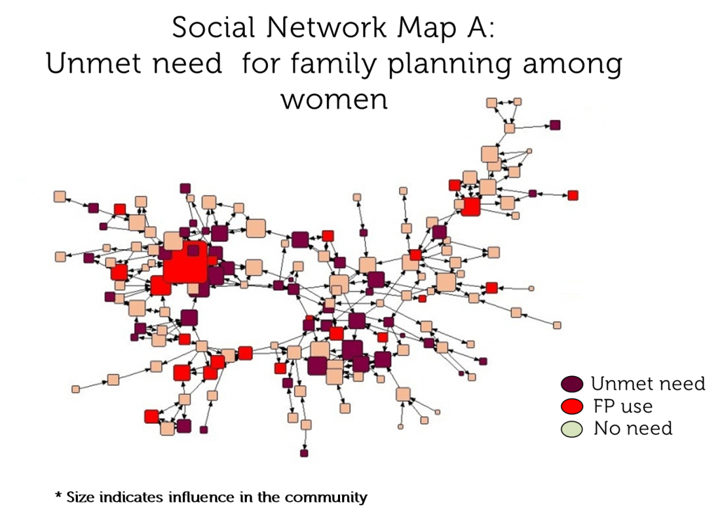
Social Network Analysis can be represented through social network maps like those below. In these maps, each node represents a single person while links between them show relationships between individuals. Social network maps provide both a visual and a quantitative snapshot of human relationships, as they illustrate how people are connected and share information with each other.
See if you can answer the questions below about what these social network maps can tell us about the communities they represent.
Answer & Explanation
Answer: More women with unmet need or no need.
Explanation: Each square in the map represents a person. The bright red squares represent family planning users, which are relatively few. Most of the squares are light pink (people with no perceived need for family planning) and dark red (people with unmet need).
Question #2
Does village in Map A have a supportive environment for family planning use?
Answer & Explanation
Answer: Village in Map A does not have a supportive environment for family planning use.
Explanation: The size of each square in Map A indicates the influence of that person in the village social network, measured as the number of people in the village that the individual is connected to. The largest bright red square represents the one highly connected individual in the village. The remaining red squares are few and smaller, indicating an nonsupporting environment for family planning use.
Question #3
Answer & Explanation
Answer: Men are more connected and more influential.
Explanation: Men are represented by squares, and women by circles. The size of their shapes indicates how connected they are. Since the majority of squares (men) are larger than the majority of circles (women), men are more connected than women.
 Where We Work
  Press Room
  FACT Project
  Passages Project
  Learning Collaborative
  Search All Resources
  Social Norms
  Fertility Awareness Methods